This site provides concise, searchable notes about how to do common tasks in Adobe Illustrator and about the underlying concepts that make it possible to use Illustrator creatively. The goal here is not to present a tutorial, but to help you recall and apply what you may have learned in video courses. In other words, if you took a number of video courses and then made very precise and extensive notes, you might come up with the starting point of this site.
In addition, this site offers two features that make it smart:
You can search the site with a search engine (Smart Search), that is optimized to search a single site and be aware of the outline of each page and the types of content on the site.
Page Outline at the top right of each page. Click to see a larger image.
Smart Search is based, not on generic Web search technology, but on our own database driven search engine that we designed specifically for searching the contents of a single site that is dedicated to a single subject.
Web Search engines (bots or spiders) are designed to crawl millions of sites across the Web. In contrast, Smart Search uses intelligence about the subject matter of this site to make it fast and easy for you to find very specific information about the subject, in this case, Adobe Illustrator, that has its own features and internal logic. It works because Smart Search understands and lets you search by both the context and the type of content that you are looking for.
Context
Each page has an exceptionally detailed hierarchical structure made up ultimately of many sections, subsections, sub-subsections etc., each of which has its own title. The terms in the section titles capture the subject matter and the outline of the sections and sub-sections captures the hierarchical organization of each page. Smart Notes uses the outline in three ways:
The entire outline appears in the top right column of each page, which not only gives you an overview of the page's content, but also provides links to the sections.
Breadcrumbs at the top of each section heading. Click to see a larger image.
It allows the system to construct for any section, a sequence of links to the section titles (i.e. a path of breadcrumbs) that lead from the Page title down the outline to the title of the current article or section. The system places the path of breadcrumb links directly above each article's title. This allows you to easily move up the breadcrumb path to explore the context that leads to the current article. And, since each element in the breadcrumbs begins with the page title, you can return to the top and the Site Search facility by clicking the first link in any breadcrumb path.
Context in the Auto-complete list. Click to see a larger image.
In the Search facility, the system puts the breadcrumbs right in the auto-complete list. This gives you precise and comprehensive context information about each item that matches the search so that you can easily choose the most relevant result when several results match the same query. The context makes it possible to do meaningful searches even for common terms that appear in many different contexts.
Type of Content
To make it even easier to find exactly what you are looking for, Smart Notes classifies its content into four types:
How-it-Works sections that explain the underlying concepts and unifying principles of each topic.
How-To articles that explain how to perform specific tasks related to a topic. This type of content also includes key phrases that are highlighted in the text.
Definition paragraphs that explain the meaning of key terms.
Option paragraphs that explain the effect of the options that Illustrator provides in the dialog box forms that it uses to implement the tasks explained in the How-To sections.
Unifying Concepts
This section describes unifying concepts and recurring themes that will enable you to understand how Illustrator works and to use it creatively. Subsequent pages will explain these concepts in detail, but for now here is a preview.
Structure and Appearance
In Adobe Illustrator (Ai) the fundamental graphic object is the Path. Paths have two independent dimensions:
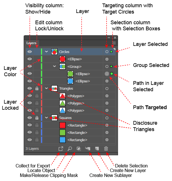
A Structure, which is defined by Anchor Points, and Control Handles. You create a Path by using a drawing tool (e.g., the Pen tool) to define its Anchor Points and Control Handles. Illustrator represents paths in its Layers panel.
To be visible, a structure must be given an Appearance, which is defined by attributes such as its Fills and Strokes. Attributes have settings which are displayed in the Attributes panel. For example, the Fill attribute will have a color, and a stroke attribute will have a setting for both color and width.
A path's structure and its appearance are independent. You can give the same path different appearances, and you can apply the same appearance to different paths. In fact, you can save a set of appearances as a Graphic Style and apply the entire Graphic Style to objects with very different structures.
Ai also provides more complex structures including:
Layers, are the highest-level containers in Ai. Ai always creates new paths in a Layer, which it represents in the Layers panel. When you create a new document's first path, Ai will create a default layer, make it the current (i.e., the selected) layer and place the new path in it. There after Ai will always place a newly created path or other complex structure in the currently selected Layer. You can use the Layers panel to select a Layer and to create new Layers.
Groups are containers that reside in Layers and allow you to group paths (and other groups together, so that they behave much like a single object.
Text, which is a group like object that contains, not paths but characters.
Combination Objects , i.e. objects created by combining other objects, which include:
Compound Paths, which are paths made up of two paths, one of which defines the objects outer boundary and the other which defines an inner boundary around a hole.
Compound Shapes, which are smart objects that are like compound paths but remain editable.
Pathfinder Objects, which are groups that are created by combining objects using a legacy tool called the Pathfinder Panel.
To give objects a comprehensible structure, you typically create several layers into which you move
the paths (and other objects). When you create a new path,
Ai will put it in the currently selected Layer.
Layers panel features.
Note that:
To edit an object, you must select its structure, which you can do either in the Layers panel or on the Artboard.
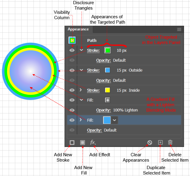
To edit an object's appearance, you must target it, (i.e., activate its Target Circle) in the Layers panel and target its appearance (i.e., select its row)
attribute in the Appearance panel,
However, Ai makes these common tasks easy. When you select an object in the window, Ai selects the layer in the Layers panel and makes an intelligent guess at which object or objects to target. The Layers panel displays both the selection and targeting. To see the details about a targeted object's appearance attributes, you must use the Appearance panel.
Appearance Panel Features
To fully understand any Ai procedure, you must understand the procedure’s effects on the Layers panel and the Appearance panel. Therefore, all of the "how-to" instructions in these notes will include a description (and often a screen shot) of the before and after disposition of both the Layers and Appearance panel, and will assume that you work with both the Layers and the Appearance panel open.
Stacking Order
In Illustrator, containers, objects in containers and the attributes in the Appearance panel have a Stacking Order, which is the order in which Ai renders them and the order in which they appear on the Artboard. When items overlap, those that are rendered first are obscured by (and therefore, appear to be behind) items that are higher up in the stacking order and rendered later.
Stacking of Layers in the Layers Panel
Layers have a stacking order inside the Layers panel. Ai renders each Layer and all the objects contained in it, in the order, from bottom-to-top, in which they are stacked in the Layers panel. Therefore, all objects in the top Layers will obscure, and appear to be on top of or in front of any objects on the lower Layers
Stacking of the Objects within a Layer
Ai will always place an object in the currently selected layer. If no layer has been created, Ai will create a default Layer named Layer 1. In general, a Layer will contain several objects, and each Layer has a disclosure triangle, which you can use to show or hide its contents.
Within a Layer, the objects, which may include groups, have a stacking order, which as you might expect is:
The order from bottom to top in which the objects were created in the Layer, and
The order (from bottom to top) in which Ai renders each object when you display it on the artboard, and
The apparent depth of the objects on the screen. Objects higher in the stacking order, which are rendered later, will obscure and appear to be in front of objects that are listed lower and rendered earlier.
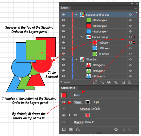
Stacking within a Group
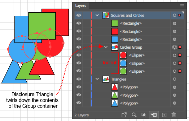
The Circles Group behaves like a single object within the Squares and Circles Layer
Similarly, if you place objects in a Group (via the Object > Path > Group command, shortcut: (Ctrl + g), the objects will have a stacking order within the Group. The Group will appear as an object in a Layer. You can twirl open the Layer to reveal its objects, and twirl open the Group object in the Layer to reveal the objects contained within the Group.
As with the order of the Layers and the order of the objects within a Layer, the order of the objects within a Group represents both the order (from bottom to top) in which Ai will render the objects, and the apparent depth of the objects within the Group.
Stacking of Object’s Appearance Attributes
Positioning Strokes on a Path with a Basic Appearance
As with the above cases, Appearance Attributes have a Stacking Order, and the Appearance panel is the only place that displays all of a selected object's Appearance Attributes and allows you to change their stacking order. The stacking order in the Appearance panel comes into play when:
Positioning strokes along a path with a Basic Appearance, and when
Working with a path that has a Complex Appearance.
Complex Path in the Appearance Panel
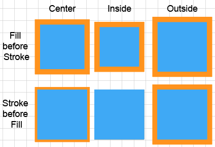
The stacking of appearance attributes is relevant, even for something so simple as properly showing strokes on a path with a Basic Appearance (i.e., a path with just one fill and one stroke). By default, Ai places the Fill before (under) the Stroke and therefore applies the Fill first and then applies the Stroke on top of it. The six squares in the Positioning Strokes on a Path... figure show why. The Stroke panel, which you can launch from the Appearance panel, allows you to position the stroke on the center, on the inside, or on the outside of a path. If, as in the second row of squares, Ai applied the Stroke first, when it applied the Fill, it could cover up part or all of the Stroke.
In contrast to paths with a Basic Appearance, a path that has several Fills, Strokes, or Effects is said to have a Complex Appearance. An
Illustrator Effect is a feature that allows you to further modify the appearance of an Appearance Attribute while it remains editable. You can apply Effects by clicking the fx icon at the bottom of the Appearance panel and selecting an Appearance from a pop-up menu. As you add Fills, Strokes, or Effects, Ai will record them in the Appearance Panel and will allow you to change their Stacking Order or to launch operations to edit them. The accompanying figure (Complex Path in the Appearance Panel) shows the panel's display of the attributes for a path with 3 fills and 2 strokes.
Note that the distinction between simple and complex paths also comes into play when you want to reduce paths to their simplest form, a process called Expanding a path, which you might want to do when, sending art to a printer, sharing art with other programs, or to convert paths with Effects into Basic paths so that you can edit them. You can reduce a path with a Complex Appearance to an equivalent looking object made up of several paths that have Basic Appearances, by selecting the path and executing the Object > Expand Appearance command. In addition, you can further disassemble a path with a Basic Appearance, into an object that is made up of simple paths that have only one Stroke, or one Fill, by executing the Object > Expand command.
Nested Stacking and the Containment Hierarchy
The stacking orders in the Layers panel, in a Group, and in the Appearance panel.
You can nest containers inside one another to create a hierarchy, which will give a composition a structure that is comprehensible to your future self and to your collaborators. Furthermore, as shown in the accompanying figure, you can use the Layers panel to easily select a single object (or set of objects) anywhere in the hierarchy of containers by clicking the selection squares in the Layers panel. When you select an object in the Layers panel, Ai will show the object in the Appearance panel, where you can see the stacking order of its appearance attributes, and can easily launch the Strokes panel and the Swatches panel to adjust the attributes.
For example, if you have perfect forethought, you could draw the triangles, circles, and squares in the above figure in just the right order so that they overlap as shown. In practice, those of us with less than perfect forethought, might draw the figure as follows: (A) draw each set of 3 objects from left to right on the Artboard in a single Layer, then (B) move the objects in each set up or down in the Layers panel to get them to have the correct depth relative to one another, (C) group the triangles, circles, and squares (which we want to behave like a single object) each into their own Group container, and finally (D) in the Layers panel, drag the Circles group so that it is on top of the Triangles group, and the Squares group so that it is on top of the Circles Group.
The hierarchy of a composition's container structure affects more than the apparent depth of the objects. For example, it determines the scope of the Object > Arrange command. Suppose that an object is inside a Group, which is inside a Layer, and you apply an Object > Arrange > Send to Front command. Then Ai will move the object, not to the top of all the objects in the Layers panel, or even to the top of all the objects in the layer, but only to the top of all the objects in the Group. The result will depend upon the container's position in the containment hierarchy.
For example, in the above figure, if you selected the green circle and executed the Object > Arrange > Bring to Front command, Ai would move the green circle to the top of the other circles in the Circles group, but it would not overlap any of the squares in the Squares group.
The organization of this site reflects both the above concepts and a common strategy for creating art with Illustrator. The next page, Paths, will focus on Bezier curves and the structure of paths that are created with the Pen tool. The Pen tool is the most revealing and powerful way to create paths, but it is also the most difficult to use. Ai provides easier ways to create paths, but you cannot really understand them without knowing how you create paths step-by-step with the Pen tool.
After discussing Paths, the next page will cover Appearances and will focus on the mechanics of adding appearances to a path's structure.
Subsequent pages will follow the steps in a typical work-flow:
Managing paths with containers and selecting paths that are inside containers.
Using path tools to create paths more quickly and accurately than using the Pen tool.
Using the facilities of Illustrator's interface to work more productively.
Style
I observed the following guidelines in constructing these notes:
In the text, searchable content is highlighted with special formatting:
The titles of How-To sections and of How-It-Works articles are formatted as headings. The size and color of the headings show the section's place in the hierarchy of the page's outline.
Key phrases are highlighted in black bold font.
Terms that are defined in a paragraph or in a list item are highlighted in red bold italic font.
The options available in dialog box forms are highlighted in green bold font.
(Non-searchable phrases that are intended only to highlight important comparisons and contrasts is highlighted in blue bold font).
Because the Layers panel and Appearance panel are so important in understanding the state of a document and because changes in the state of these panels is so critical to understanding how tools and procedures work, it makes sense to work with these panels open. Therefore, when there are several ways of accomplishing a task, the ones that make use of the Layers panel and the Appearance panel are given preference.
Similarly, these notes do not burden the reader by attempting to document every possible method to accomplish a given task. When there are many ways to do something, I focus on the methods that use the panels listed in the Window menu.
When operations use menu commands, I include the entire menu path of the command, rather than simply giving the name of the command or just the shortcut. A typical step in a set of instructions might read: "Execute the Object > Paths > Join command (Alt + Ctrl + j).
Rather than litter explanations with redundant instructions for both Apple and Windows, I have assumed that most Mac users can translate readily from an instruction written for a Windows user.
I capitalize nouns (such as Group, Layer, Stroke, or Appearance) that have a special meaning in Illustrator. For example when referring to objects that are inside of a container, I would say that they are "in a Group," but to refer to objects that have the same style, I would simply refer to "the group of flowers in the foreground."
Illustrations are intended to go well beyond screen shots. They are designed to illustrate principles and techniques and will often show how operations on the Artboard and in the Layers and Appearance panel correlate with one another. I have tried to apply the principles of Edward Tufte, especially those that encourage:
Using side by side comparisons, or an array of small figures, to enforce important comparisons and contrasts.
Avoiding large areas of vibrant colors that visually convert negative spaces into objects.
Making diagrams information rich to entice the viewer to explore them.
Avoiding using numbers or letters to name parts of a diagram and then referring to the numbers or letters in explanatory text, This forces the viewer to make distracting cross references, which become more difficult as the distance between the text and the diagram increases. In the figures used here, all explanatory text will appear in the diagram itself.